Precision Motors — Dashboard
Animated case-study cut. Palette, chrome and scenes from the project spec; every cue timed to the measured word starts of the voiceover.

Designed, not just built
It files itself
The answer is already there
A fairness decision
Most business software is ugly,
because nobody ever decided it should not be.
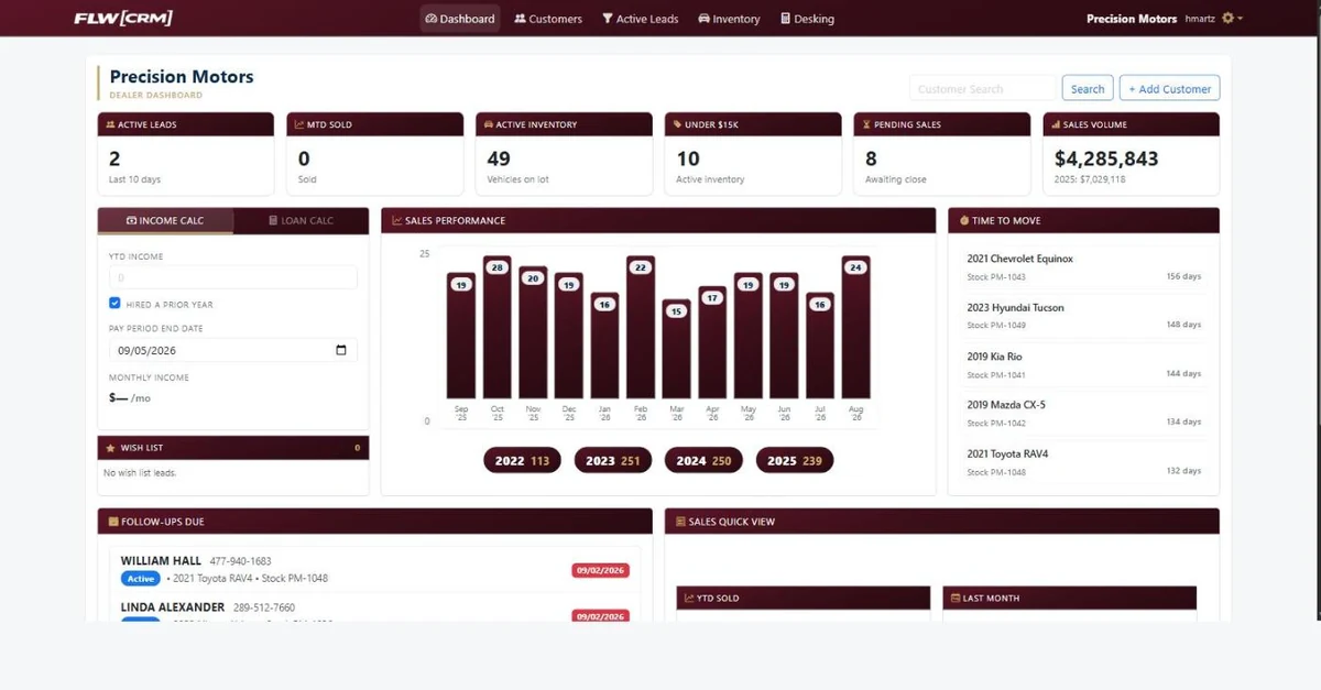
I designed and built this for an auto dealership,
and the first thing to notice is that it is nice to look at.
Real hierarchy, numbers you can read across a desk,
the state of the whole business on one screen.
Somebody stares at this for eight hours a day.
That is not a luxury.
That is the job.
Here is what it does.
An inquiry arrives, from any of the clients lead generating sources,
and it files itself.
One record, tagged with where it came from and what the customer asked about,
workable the moment it lands. No retyping.
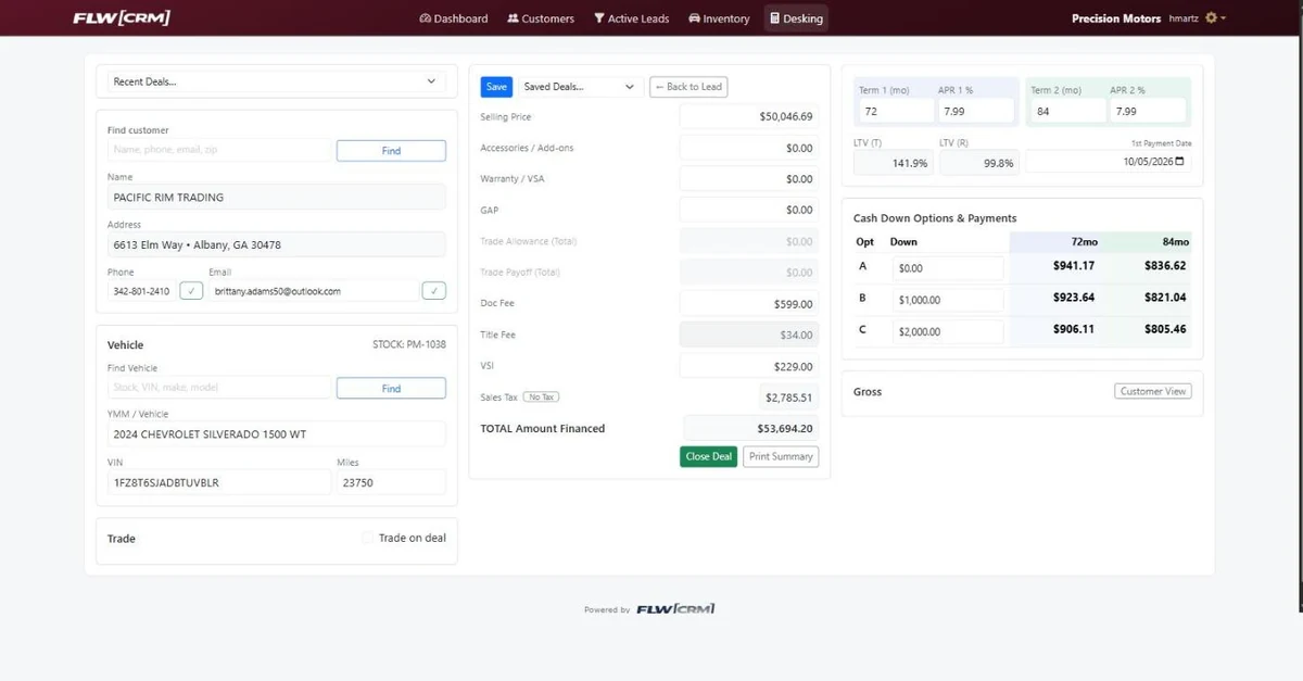
One button carries that customer into the deal screen,
and the whole thing prices out in a single view the monthly payment at two different terms against three different down payments,
side by side. So when the customer asks what would my payment be,
the answer is already on the screen.
I built it on well understood technology. Nothing exotic.
The client could hire anyone competent tomorrow and they would find their way around in an afternoon.
That is a fairness decision,
not a technical one.
Auto dealers usually fall into one of two categories.
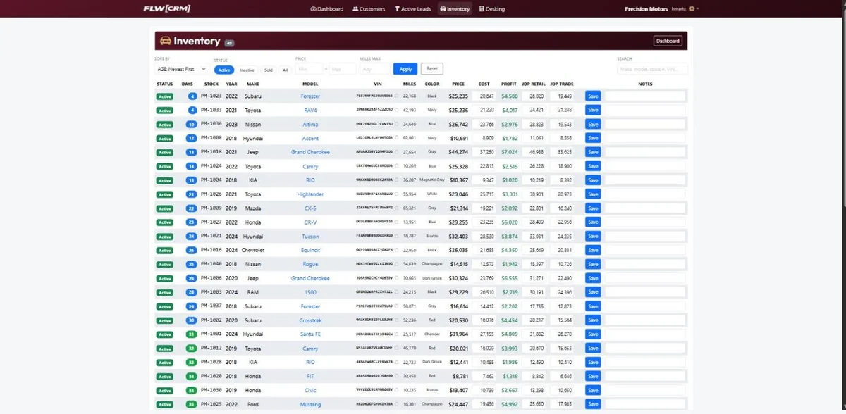
Stock in a spreadsheet somebody has to remember to update,
or an overpriced, bloated tool that does not suit your needs or your budget.
When the tools you can buy nearly fit but not quite,
and the gap is being covered by somebody's memory that gap is what I build.