Bioryx Labs — Shop
Animated case-study cut. Palette, chrome and scenes from the project spec; every cue timed to the measured word starts of the voiceover.

It does not look like the theme
One angle, one light
Calm looks expensive
Ninety four for speed
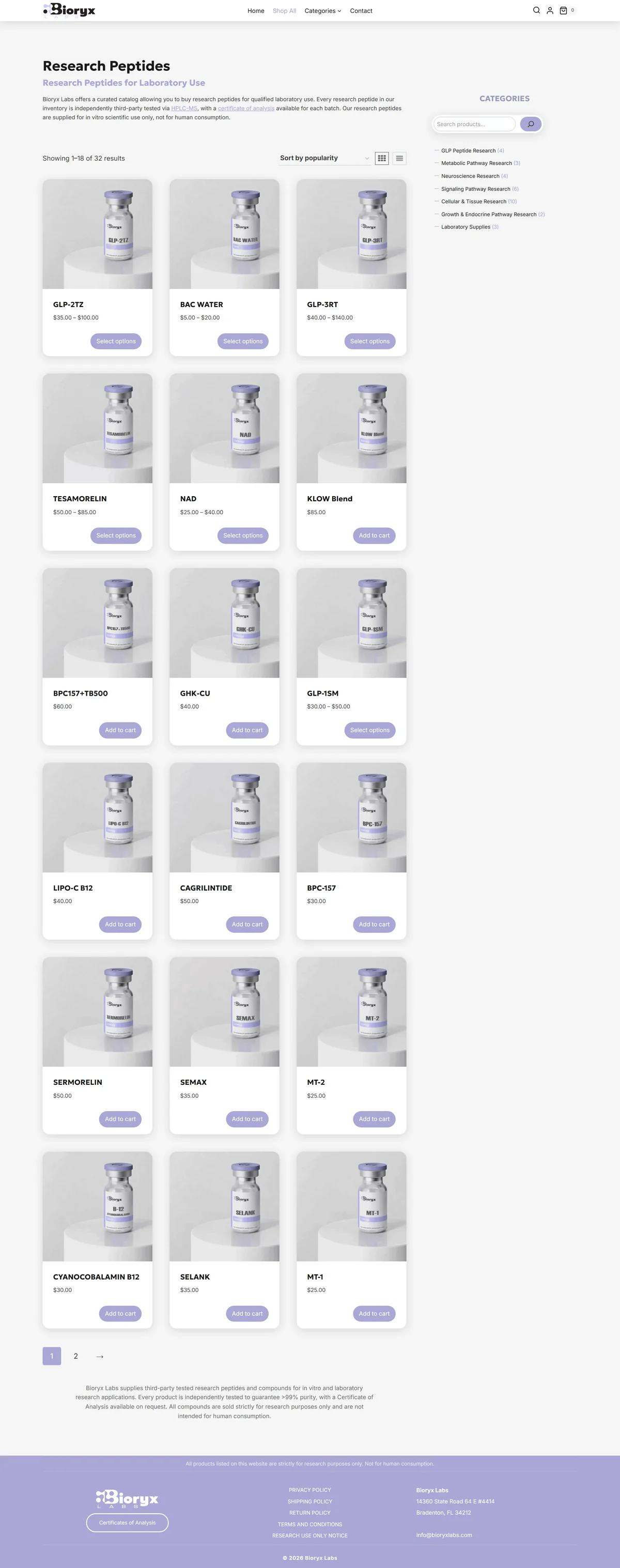
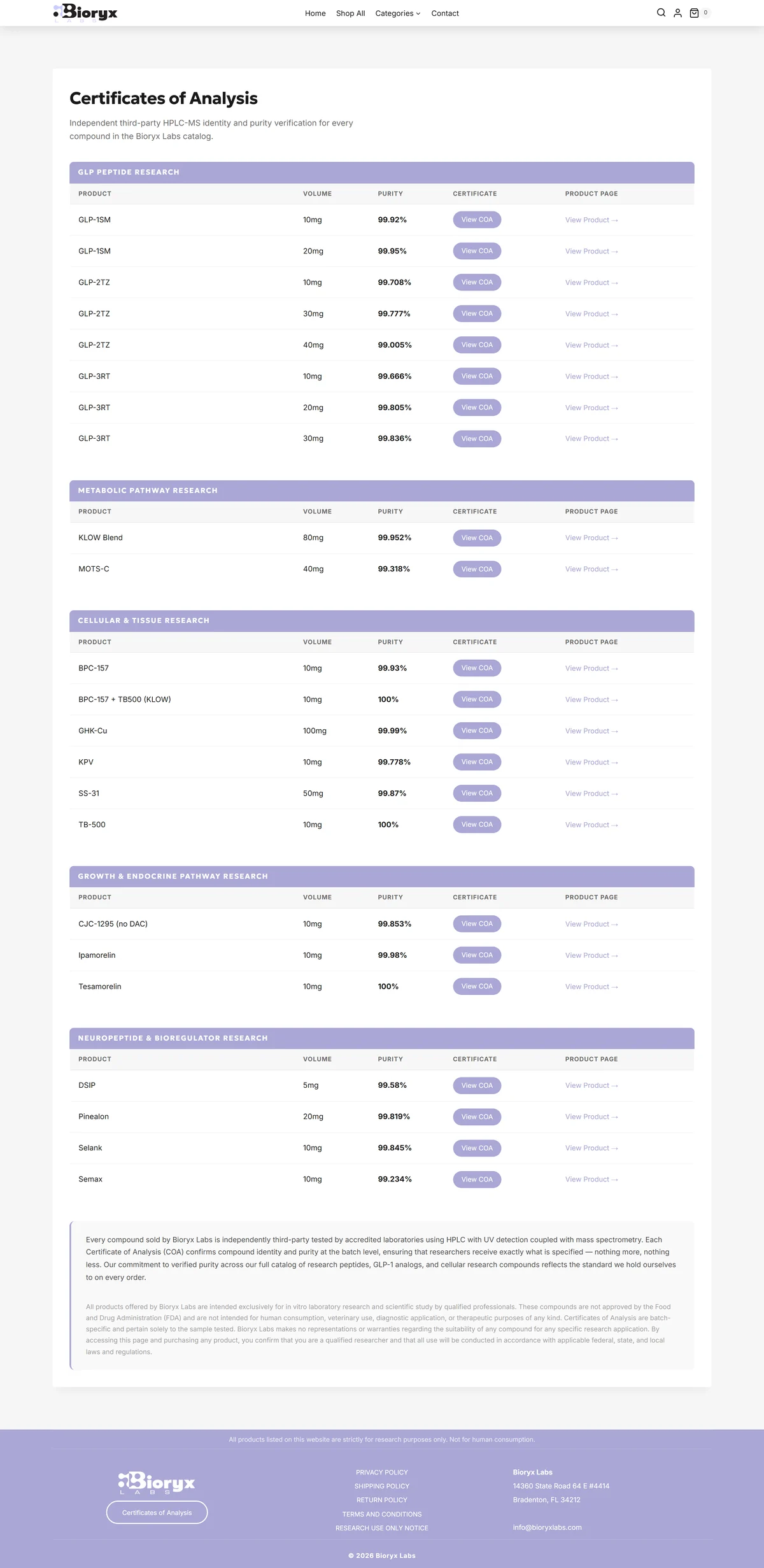
Most stores built on this platform look like the platform.
This one does not.
Soft lavender against near white.
One color, used sparingly. One typeface.
And a great deal of light.
The panels are real frosted glass semi transparent,
with a genuine blur behind them,
so the cards lift off the page without a hard border anywhere.
Most themes fake that with a gray box.
Every product is shot the same way,
at the same angle, on the same background.
That consistency is what makes a minimal layout feel designed rather than unfinished,
and it is why you can scan the whole grid without stopping to re orient on every tile.
It is easy to make a store look busy.
It is hard to make one look calm,
and the calm one is the one that looks expensive.
Underneath the design it is an ordinary,
fully featured store.
Cart, checkout, variable products,
stock, tax and shipping,
all standard so the client runs it with skills they already have.
And it is fast because of the design,
not in spite of it.
One second to load on a computer,
ninety four for speed,
a perfect hundred for search,
zero layout shift on a phone.
One typeface, one color,
no decorative weight, images sized to what they actually display.
Restraint and speed are the same discipline pointed at two different problems.
If you sell anything online,
this is the reference build.