Bioryx Labs
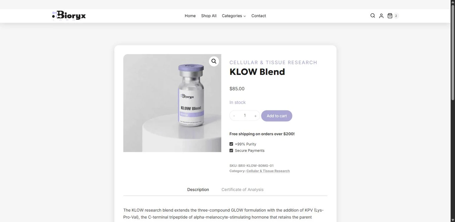
Our client had a specific request, and we delivered. Beautiful lavender, frosted glass, transparency, and an e-commerce store that performs.
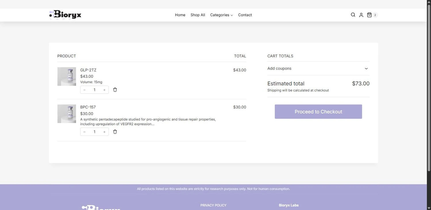
Soft lavender, frosted glass and a great deal of light. A WooCommerce store designed to look like the product it sells — precise, clean, and completely uncluttered — and a perfect 100 for search underneath it.
Most WooCommerce stores look like WooCommerce. This one does not. If you want a shop that carries a real brand instead of a theme, that is the work — and it is a full commerce platform underneath, not a pretty page.
The problem
An online store gets about two seconds to say what kind of company you are. A stock theme with a product grid dropped into it says we bought a template, and when the customer is buying consistency and care, that is the wrong first sentence.
Gallery


How we built it
Lavender, and a great deal of white
A single soft violet against near-white, used sparingly — the buttons, the accents, the footer, nowhere else. Restraint is the whole design: one colour, one typeface, and enough space around everything that the products read as objects rather than listings. It is the difference between a shop that looks expensive and one that looks busy.
Frosted glass, done properly
Semi-transparent panels with a real backdrop blur sit over the product staging, so cards lift off the page without a hard border anywhere. Most themes fake this with a grey box. Done with actual translucency it gives the store depth while keeping it calm and flat — a genuinely modern surface, not a 2019 one.
Minimal, but never empty
Every product sits on a soft-lit plinth, shot the same way, at the same angle, on the same background. That consistency is what makes a minimal layout feel designed rather than unfinished, and it is why a shopper can scan the whole grid without stopping to re-orient on every tile.
A full WooCommerce store underneath
Cart, checkout, variable products, stock, tax and shipping — all standard, so the client runs it with skills they already have or hires anyone who knows the platform. The design sits on top of the commerce, and nothing about the look makes the shop harder to operate or more expensive to maintain.
Fast because there is nothing spare in it
Zero layout shift on mobile, a one-second load on desktop, and 100 out of 100 for search. The speed is a consequence of the design rather than a separate project: one typeface, one colour, images sized to what they actually display, and no plugin doing work the theme already does.
Stack
- WordPress
- WooCommerce
- PHP
- Code Snippets
- REST API
- Hostinger
- WebP
Measured performance
Google PageSpeed Insights, 29 August 2026. Median of five runs, measured at this site's own address. Speed is the desktop figure. Where SEO, accessibility or best practices differ between mobile and desktop, the lower of the two is the one shown.
- Largest contentful paint
- 1.0 s
- First contentful paint
- 0.4 s
- Speed Index
- 2.2 s
- Layout shift on mobile
- 0
The decisions that mattered
Why the restraint is the design
It is easy to make a store look busy and hard to make one look calm. The calm version requires every product photographed identically, every card the same height, one accent colour used four times on a page instead of fourteen, and type that never competes with what it is describing. That discipline is most of the work, and it is precisely the part a theme cannot do for you — a template gives you a layout, not a point of view.
The errors that only show up if you go looking
An SEO plugin's fill in missing descriptions option had helpfully filled a set of category icons with the page title — which on a front page is literally the word "Home", so that is what they were reporting themselves as to search engines and screen readers. We fixed it in the page markup rather than by switching the option off, because that option does useful work everywhere else. Verified corrected on the live site. Checking after launch is part of the build here, not an extra: this is exactly the kind of thing that is invisible from the inside and only ever found by looking for it.
Beautiful and fast are the same decision
A store that loads in a second on desktop, does not move while you read it, and scores 100 for search did not get there by having speed work done afterwards. It got there because the design has one typeface, one colour, no decorative weight, and images sized to what they display. Design restraint and performance are the same discipline pointed at two different problems — which is why we do not treat them as separate line items.
What this means for your business
If you sell anything online, this is the reference build. A brand that looks like yours rather than a theme, on a commerce platform you can hire for anywhere, fast enough that nobody leaves before it loads, and correct enough that search engines can read all of it. Equipment, materials, gear, supplies, apparel — the platform underneath does not change, and neither does the standard.
Want a site that does this for you?
Start with a free audit — a written report on how your site performs today and what it would take to put it in this company. No pitch attached.
Get a free audit →