Flow Brazilian Jiu Jitsu
Animated case-study cut. Palette, chrome and scenes from the project spec; every cue timed to the measured word starts of the voiceover.

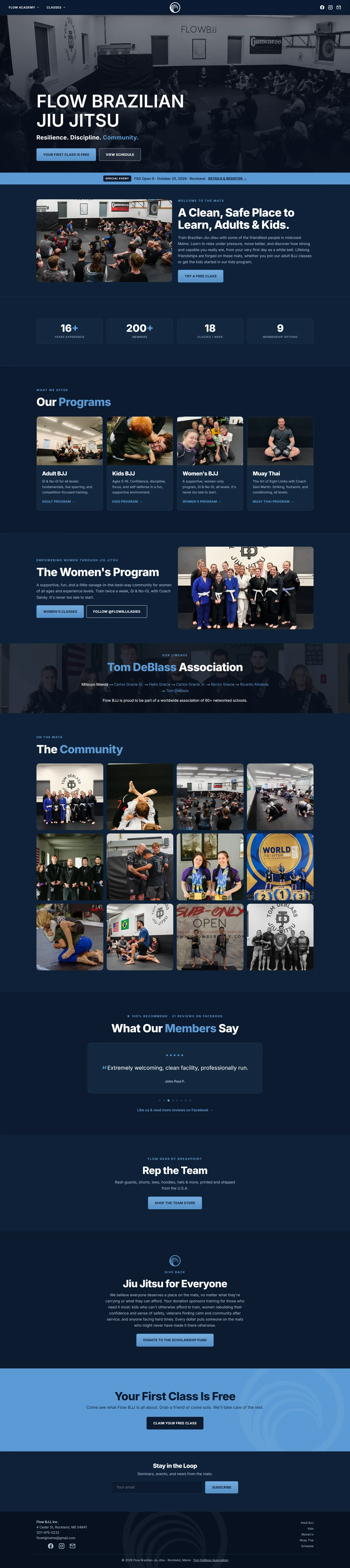
It looks like the business
One offer, nothing in front
Built at phone width
Same page, any trade
One record, tagged on arrival
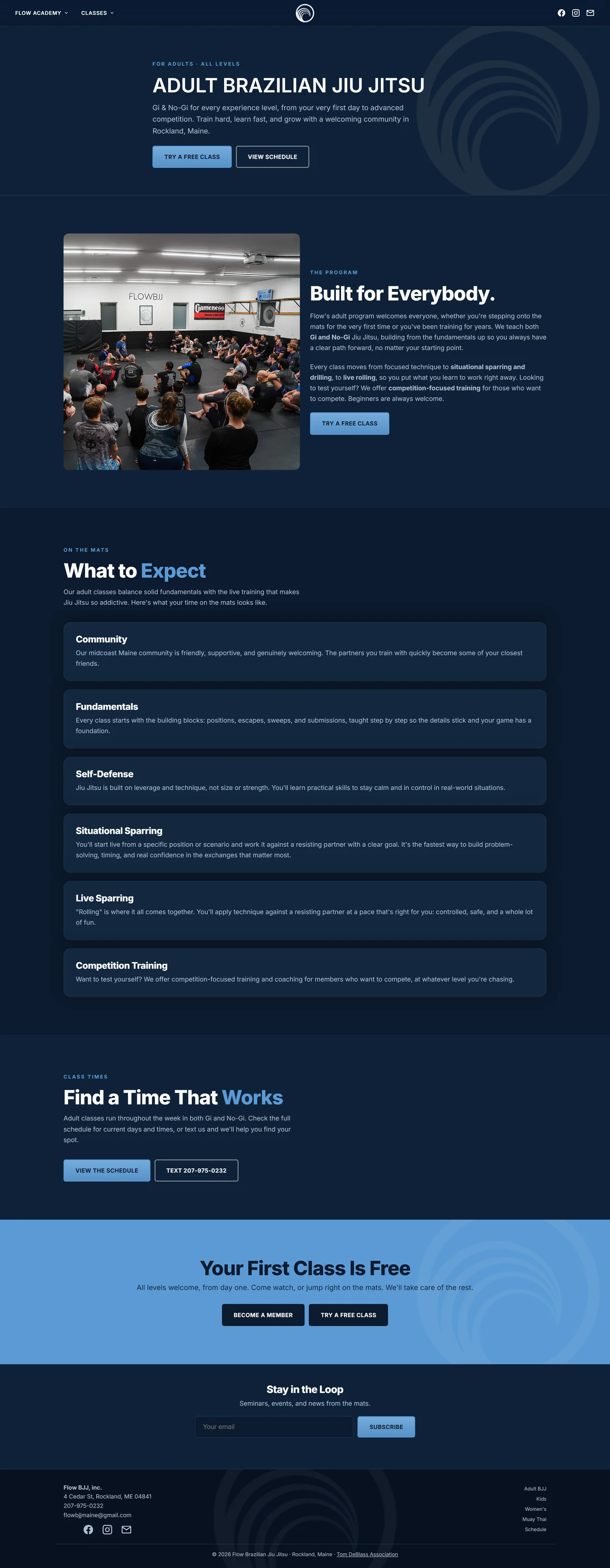
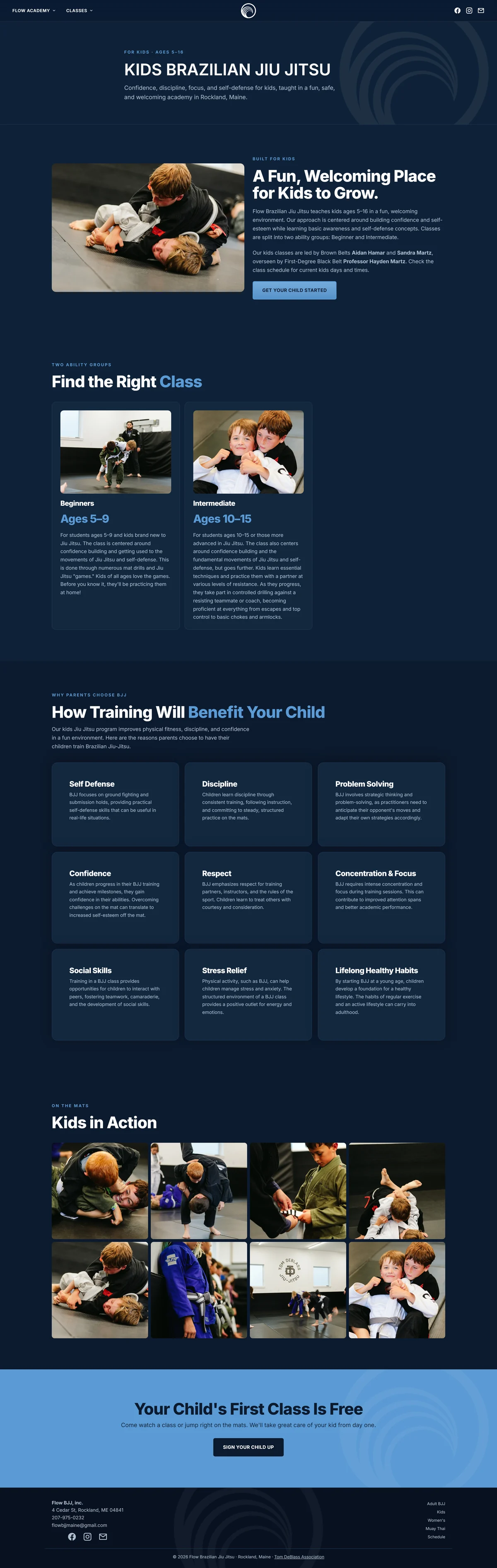
Deep navy, one clean accent,
wide confident type, and full width photography of the actual room and the actual people.
This site looks like the business it belongs to.
A template cannot do that,
because a template is designed to look acceptable for a thousand businesses at once.
The design does one job.
The offer and the practical detail sit side by side at the top of the page,
and nothing is allowed in front of them.
Underneath, proof in numbers rather than adjectives.
I built it at phone width first and expanded outward,
because that is where most first visits happen.
The buttons are thumb sized and nothing needs pinching.
It loads in about a second on a computer,
ninety eight for speed,
a perfect hundred for search,
and measured layout shift of zero on a phone.
Nothing moves while you are reading it.
That last one is the least glamorous number here and the one people feel the most.
If you swap the offer for a free estimate,
a new patient consultation,
or a test drive, you can visualize the value this would offer your business.
One clear offer, the practical detail beside it,
proof underneath, in front of a visitor in about a second.
That is what any local business needs.
Most are running a template that buries all three.