Flow Brazilian Jiu Jitsu
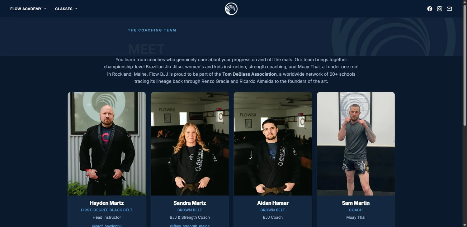
Being brave enough to walk through the door for the first time is one of jiu jitsu's toughest battles. We built a welcoming site with an easily accessible path to a free trial class, and to meet the team a potential member would be training with.
A local business whose whole job is getting someone to walk through the door for the first time. Everything on the page is arranged around that one moment — and it paints in a second flat.
The offer and the schedule land in front of every visitor in about a second, with nothing jumping around underneath them. If your best offer is three clicks down inside a template, moving it to the front is the single highest-return change available to you.
The problem
The business was on a template that buried the thing customers came for, made the free-trial offer look like fine print, and took long enough to load on a phone that people gave up before they saw it.
Gallery


How we built it
A look that belongs to the business, not to a theme
Deep navy, a clean blue accent used sparingly, wide confident type, and full-width photography of the actual room and the actual members. It reads as a real place with a real culture. Templates cannot do this, because a template is designed to look acceptable for a thousand different businesses at once.
The offer is the hero
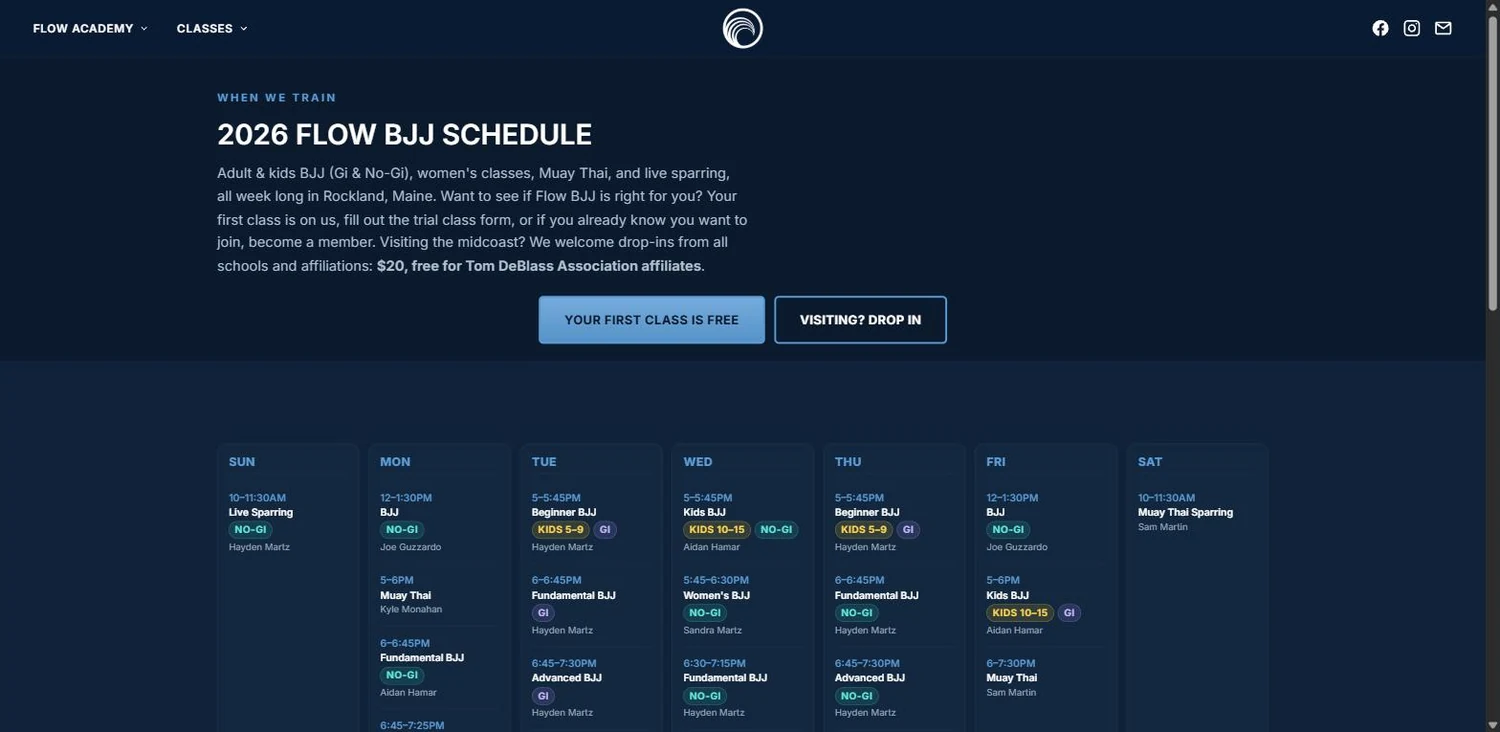
Your first class is free sits in the hero as a primary button, beside the schedule. Those are the only two things a prospective customer wants in the first ten seconds, so nothing else is allowed in front of them.
Proof before persuasion
16+ years, 200+ members, 18 classes a week, 9 membership options. Four numbers and no adjectives. Specifics are what a sceptical visitor is actually looking for.
Built for the phone first
Most first visits are on a phone, standing in a car park. Buttons are thumb-sized, the schedule is readable without pinching, and the layout is designed at phone width first and expanded outward — rather than a desktop design squeezed down until it fits.
Nothing moves while you read it
Measured layout shift is zero. Every image reserves its space before it arrives, so the page never jumps and nobody taps the wrong thing because the button moved. It is the least glamorous quality metric and the one customers feel most.
Stack
- Hand-authored HTML
- CSS
- Vanilla JS
- Cloudflare Pages
- GitHub push-to-deploy
- WebP
Measured performance
Google PageSpeed Insights, 29 August 2026. Median of five runs, measured at this site's own address. Speed is the desktop figure. Where SEO, accessibility or best practices differ between mobile and desktop, the lower of the two is the one shown.
- Largest contentful paint
- 0.5 s
- First contentful paint
- 0.4 s
- Speed Index
- 0.6 s
- Layout shift on mobile
- 0
The decisions that mattered
The first visit is a nervous one, so the page is calm
A visitor arriving here is deciding whether to do something slightly intimidating. The page answers two questions and then gets out of the way: the offer and the schedule sit side by side in the hero at every screen size, and exactly one thing is allowed to interrupt them. Everything else — programs, instructors, pricing — sits below, for the visitor who has already decided to keep reading. Restraint is a design decision, and it is the one that converts.
A perfect SEO score is table stakes, not a trophy
100 out of 100 for search means the fundamentals are all correct: titles, descriptions, canonical addresses, crawlable links, readable text, a valid sitemap. It does not by itself put you top of the results — nothing does on its own — but every site that ranks well has these right, and most small business sites do not. It is the floor, and we build every site on it.
Every deploy is verified, not assumed
After every publish, a check asserts what is actually being served and fails loudly if the live site does not match what was pushed. Most sites have no such check — they trust a green light on a dashboard, which is how a site can quietly go stale while every indicator looks fine. Yours will not.
What this means for your business
Swap the free trial for a free estimate, a new-patient offer, a design consultation or a test drive and the page is the same page. One clear offer, the practical detail beside it, proof in numbers underneath, and the whole thing in front of a visitor in about a second on a phone. That structure is not specific to a martial arts academy — it is what any local business needs from a website, and most of them are running a template that buries all three.
Want a site that does this for you?
Start with a free audit — a written report on how your site performs today and what it would take to put it in this company. No pitch attached.
Get a free audit →