Flow Sub Only — Events
Animated case-study cut. Palette, chrome and scenes from the project spec; every cue timed to the measured word starts of the voiceover.

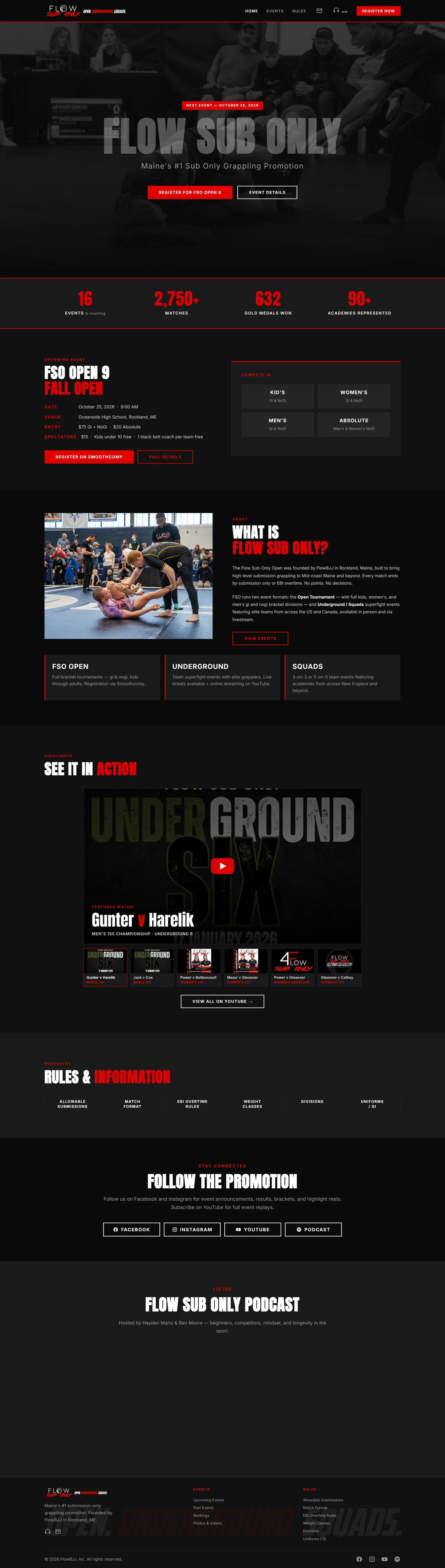
A brand with a point of view
It asks for one thing
Under three megabytes
Nothing moves
One record, tagged on arrival
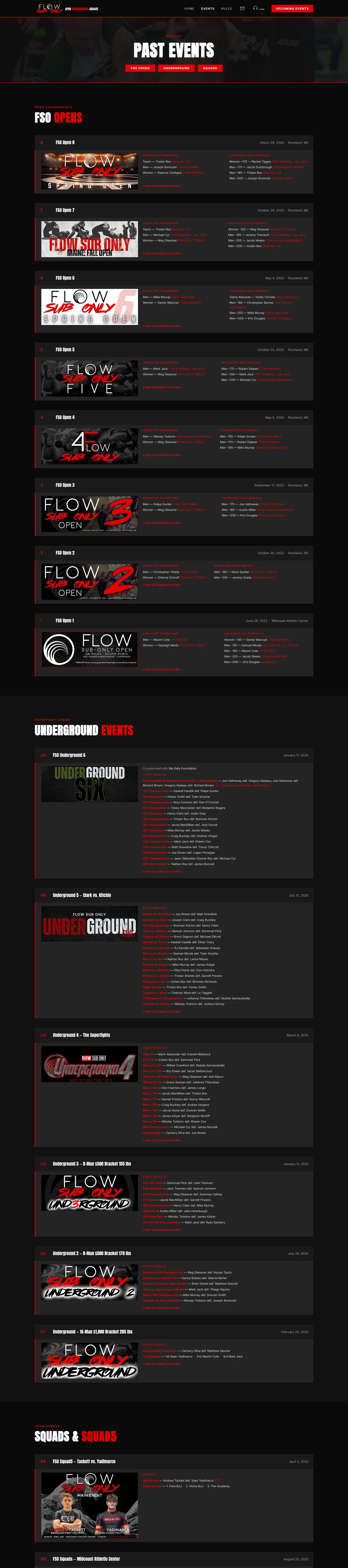
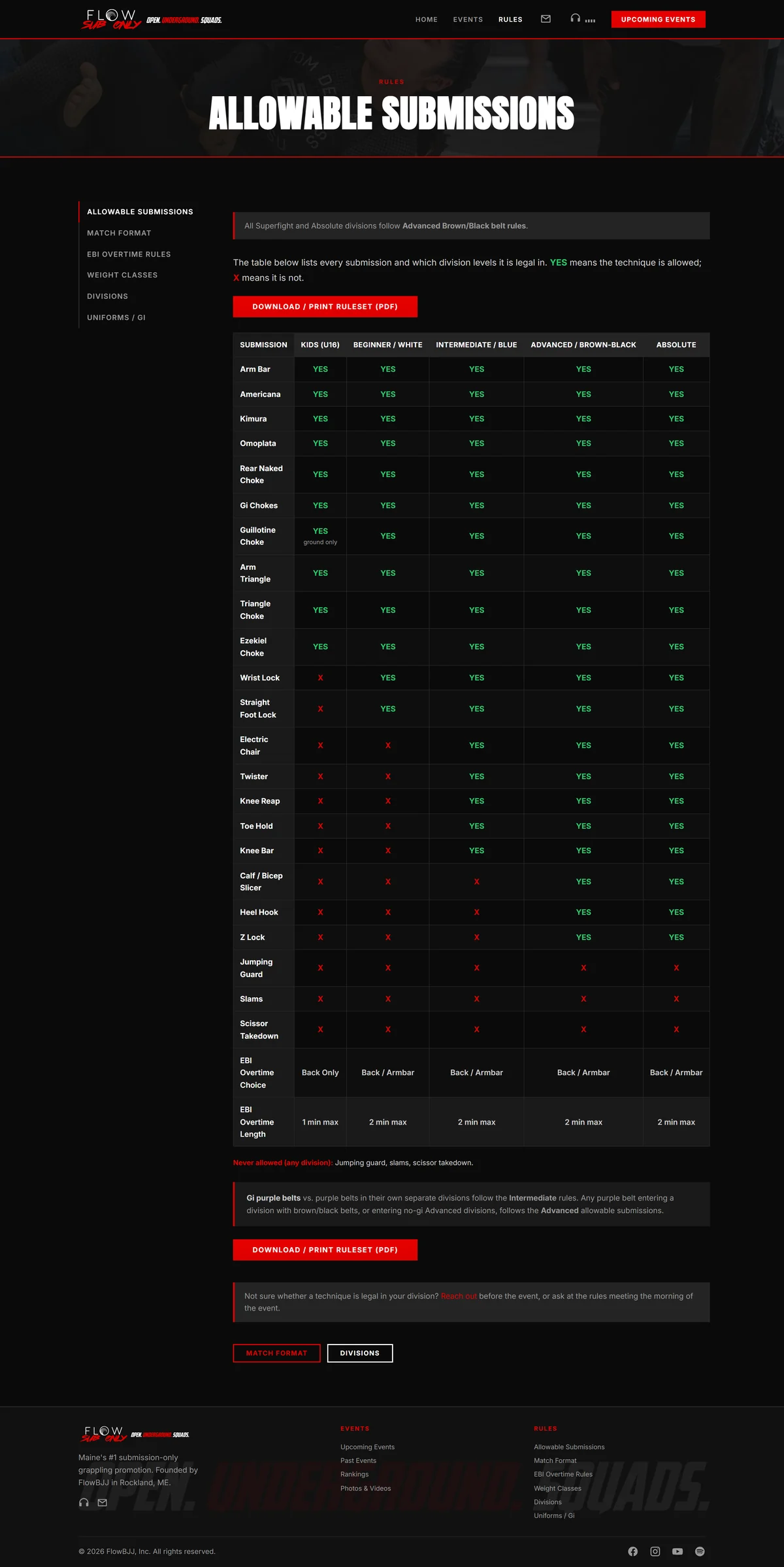
Heavy condensed type over high contrast photography.
Hard edges, no rounded corners,
two colors and white.
This is a brand with a real point of view,
and it is why the site comes across as an established operation rather than somebody's side project.
It asks for exactly one thing.
The next event and the sign up button carry the top of the page,
and nothing else competes with them.
A page that asks for one thing gets it far more often than a page offering five.
Underneath the look, it is built lean on purpose.
Every photograph is sized to exactly what it displays,
so the whole site carries under three megabytes.
The picture at the top is fetched first,
ahead of everything else,
so a visitor has something in front of them immediately instead of a blank screen.
That is the part people skip.
Design decides whether somebody trusts you.
Engineering decides whether they are still there to see the design.
It scores ninety six for speed on a computer,
a perfect hundred for search,
and zero layout shift on a phone.
Nothing moves around while somebody is looking at it,
which is the least glamorous number here and the one people feel the most.
If you sell tickets, take bookings,
or run events, this is the shape that works.
One clear thing to do,
a brand that looks like nobody else,
and a page quick enough that the person who tapped your link is still with you when it arrives.