Flow Strength — Member App
Animated case-study cut. Palette, chrome and scenes from the project spec; every cue timed to the measured word starts of the voiceover.

Software is what keeps them
Designed for busy hands
Write once, send precisely
Secured accordingly
One record, tagged on arrival
A website brings people in.
Good software is what makes everyone's lives easier.
This is the second half of that sentence: a client membership and gym owner management app.
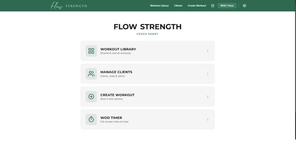
Look at how it is designed.
Deep green on white, oversized touch targets,
one job per screen.
It gets used mid session,
on a phone propped against a rack,
by somebody whose hands are busy.
Software people use standing up has to be designed differently from software people use sitting down,
and almost nobody bothers.
It does three things.
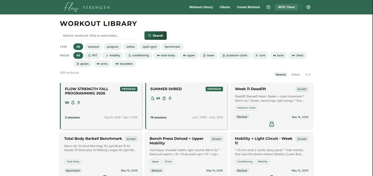
It remembers everything the business has ever run sits in a library two hundred and sixty eight entries deep,
searchable and filtered.
What used to be rewritten from scratch every week became something to draw from,
and it gets more valuable the longer it is used. It publishes.
Write it once, then choose exactly who receives it with six checkboxes.
Everyone, one group, online members,
or a single person.
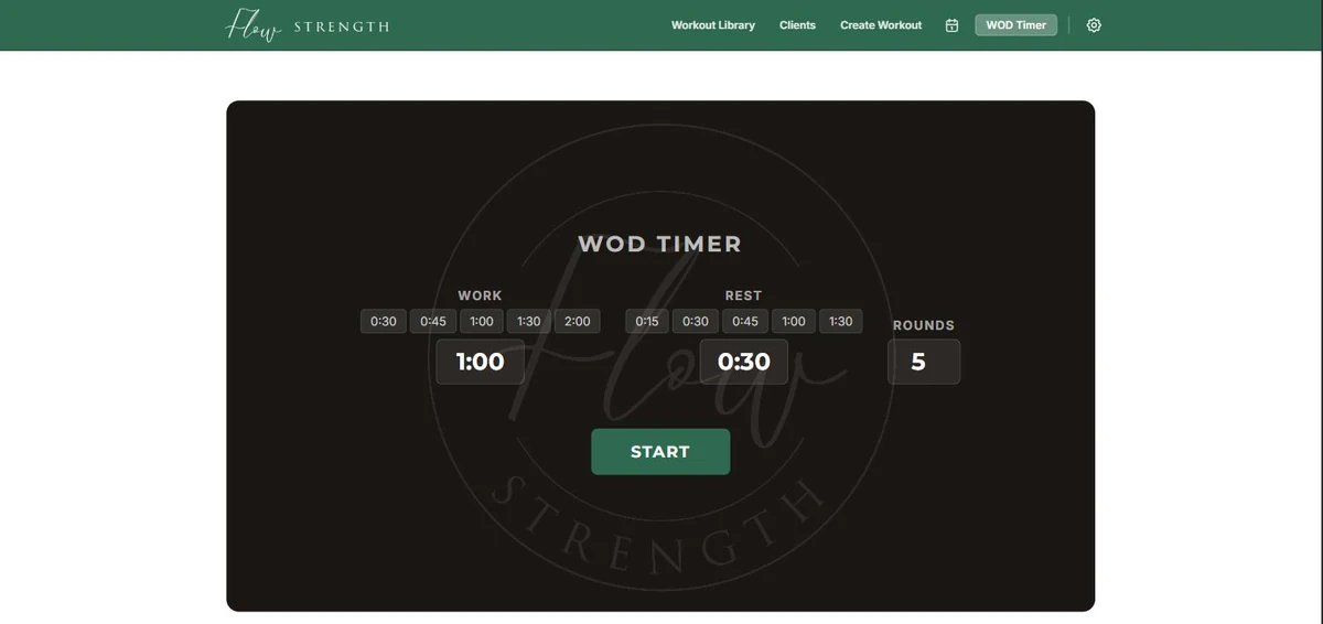
And it does the small extra thing that decides whether software becomes a habit or gets tossed aside: a full screen timer,
on the same login as everything else.
No second app, no second subscription.
It holds real customer records,
so it is secured accordingly,
and it scores a perfect hundred for best practices.
The pattern goes further than it looks.
For you, this could mean: a practice sending aftercare to the right patients.
A contractor giving each client a private page with their schedule and photographs.
A staff only pricing tool.
Same shape every time a login,
a library, and the right thing reaching the right people.